Monday, March 26, 2012

Phallic Symbol

TV Show: RuPaul Drag Race season 4
Food: Leftovers from Chinese takeout
Project: Storyboard for the Blind Swordress mini series

While editing a photo I took the other day at the Chicago Botanic Garden, I noticed that the branches and the flowers forms a shape that looks a lot like a small penis. Maybe it's just the juvenile side of me but I seriously think it does. And now I can't unsee it.


What surprises me is that this one really perverted guy I know couldn't see it but most of my female friends can spot it right away. Maybe guys just don't see dicks at that level. I should kick myself for that comment.

Saturday, March 17, 2012

Cafe scene at Cosi

Artist: Yoko Furusho
Music: International music found typically in cafes

This week we have some freakishly nice weather in Chicago (seriously, it should still be snowing right now; it's almost as weird as when it hailed in late June). So I took advance of the weather and went out to downtown to relax with my friends, get some fresh air, fill out job apps, write resume and cover letters... the usual.

On Monday, Amy and I went to Cosi, a cafe franchise, down on Michigan Ave and across from the Art Institute Museum. While she was submitting paperwork and being productive, I took out a crappy "watercolor" pad and started to draw the scene in the cafe (I guess I was being productive too in a way). I continued the piece once I return home and finished it in the middle of the night and the next morning with little sleep. Here are the results:


I didn't like the finish results that much, especially the zombie guy on the left of the piece and the monster tree in the background...and the awkward oval table to a certain degree. They throw the composition off. I scanned the image and messed with crop.


The picture looks odd to me at first because I am not quite use to the square composition(?) but it already looks a lot better with zombie boy out of the picture (sorry, zombie boy).


I crop another chunk to make the image more rectangular; however, it looks a little bottom heavy after this edit since all of the people are situated on the bottom half of the picture. And maybe I should have left the zombie guy in this picture but remove bit of the chair. Never really occur to me until now.


I decide to balance this by cropping the top but according to my friends this crop took off some of the interesting elements in the pieces, ie: the angles of the door frame.

Right now, I am leaning towards the square crop. Feel bad that zombie boy can't join us but he's in his first stage of decomposition and would probably like to be left alone anyways. The pattern for this piece is inspired by illustrative works of Yoko Furusho. She is amazing.

Sunday, March 4, 2012

6teen

Music: Haunting for Witches by Bloc Party
TV Show: 6teen
Addiction: Words with Friends (on facebook)

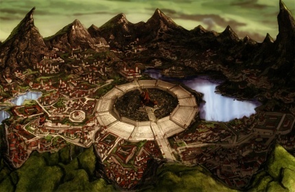
As of lately, Western animation has been a disappointment. With the exception of Avatar: The Last Airbender —which was created by Americans with the animation produced in South Korea— many (though not all) of the newer cartoons slacken in quality of their artwork. I understand that not everything has to be realistic or look a certain way; there’s nothing wrong with having a different artist style but the quality has definitely gone down a few notches since the 80’s and 90’s (even the early Y2K era). Where is the scenery porn or the fun details!? Why is everything drawn with the same line thickness? And when the style is more “realistic” the females always look so waif-like and emaciated with disproportionally large heads.

Avatar: The Official Sponsor of Scenery-porn


About a month ago, I began watching episodes of this Canadian animated sitcom, 6teen, and was thoroughly surprised and pleased by the style of the show. The show is created by Jennifer Pertsch and Tom McGillis, the same people who made the very popular Total Drama Island series. 6teen originally ran from 2004 to 2010 on the Teletoon network. The premise revolves around the lives of six teenagers, all sixteen (it's a pun within a pun!), and their part-time jobs in a mall not unlike the Eaton Centre in Toronto, Ontario. 


Looking back at it, they all look skinny with big heads too... hmm...


I was first introduced to 6teen around '08/'09 at a friend’s. The television was on in the background and the cartoon caught my attention halfway. It just so happens that the zombie episode "Dude of the Living Dead" was playing at the moment and zombie episodes are usually the best episode to start when first introduce to a new series (look at Community's "Epidemiology" for example). I didn't catch the name of the series at the time and have been meaning to watch the show since. Now that I’ve finished school, I can spend more time in "researching" cartoons, which is how I rediscovered the show.


The art of this animated series is unique in the fact that they eliminate the use of lines. It’s sorta like a more refine version of South Park (art-wise). Also, the viewer can easily differentiate the characters solely by their silhouette. The main characters consist of a pretty diverse cast as well. One thing that does bother me about it is that the characters, Caitlin (the blonde) in particular, have a tendency to buy the same outfit over and over again yet still acts like she made a whole new purchase and some of the male extras get recycled. But aside from that, the drawings are done nicely, albeit the hands are a bit blocky (I’m looking at you Jonesy), and colors are appealing. The storyline is alright. It’s a sitcom marketed towards tween and teens so what is there to expect. Every once in a while you’ll come across a continuity error and that gets annoying. Also, they have four seasons and celebrate Christmas at least three times but all the main characters stay 16 throughout the whole entire series. They do brush up on topics like diarrhea and wardrobe malfunction, which my inner child finds hilarious.


Blocky hands of DOOM!!! Also, is that Christopher Walken?

Why isn't this show more popular!?

-----
I am so bad at being consistent with my updates. Hope nobody has gotten a seizure or headaches from my background/layout. Also I have noticed that my title font looks like an emaciated version of Comic Sans. I should look into changing that or people will not take me seriously. >_> 


Disclaimer: I don't own any of the pictures. The links for the websites where they are found should be attached to the images themselves.